2017.01.24

500 Global Team
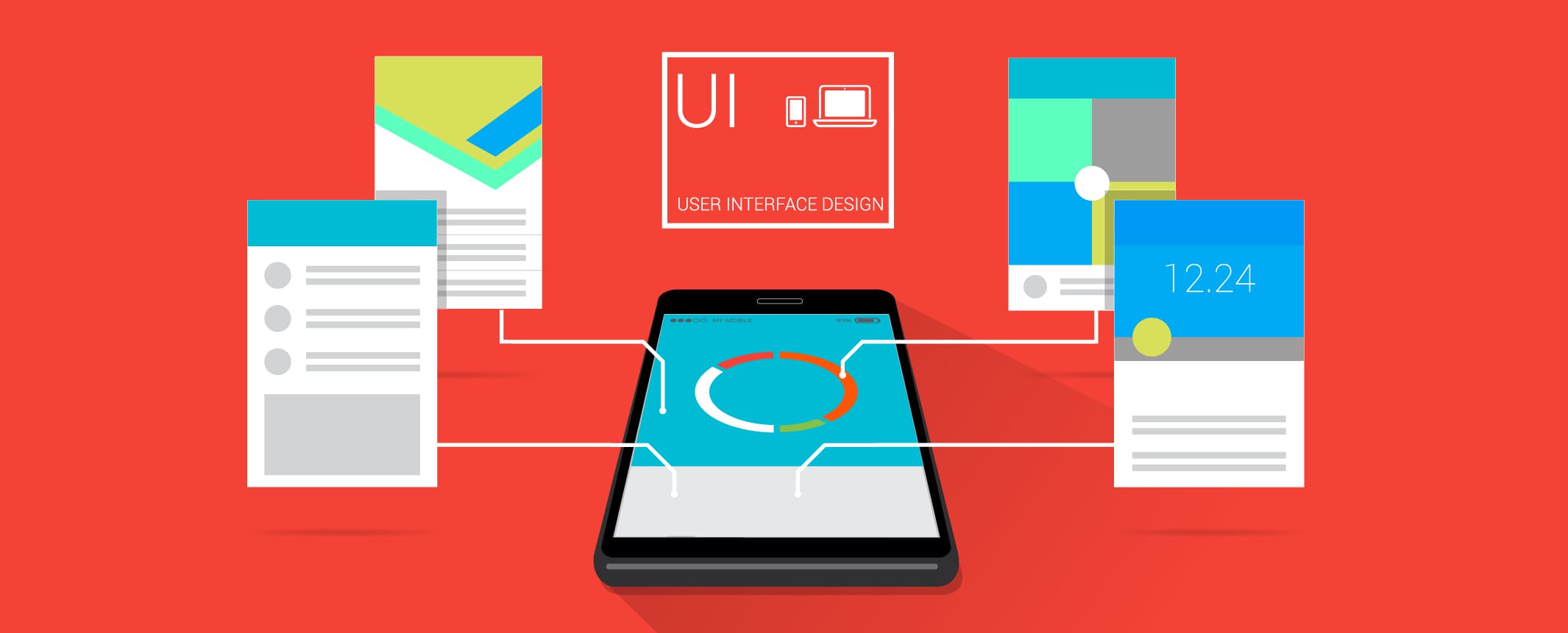
Below is a collection of my tips and feedback from a creative branding workshop I led during the most recent 500 Startups’ seed accelerator program, Batch 19. The goal was to teach startups to apply design thinking methods to improve their UX/UI , and thus increase user acquisition and market growth.
Did you know the human attention span is shorter than a goldfish’s?
[Fun Fact about Attention Span] Goldfish: 9 seconds > Human: 8 seconds.
Yep, your website has a lot of work to do in a short amount of time to get your key message to your audience.
How do you do it? Here are 7 Design Thinking Tips to Improve Your Growth Rate :
1. Integrate
Combine a strong marketing message (content) with effective visuals (form).
My Feedback for Bstow: Bstow rounds up your spare change to charity.
Below is the original design for the top half of Bstow’s home page. It has a simple marketing message, “Donate spare change to charity”. However, at first glance, the website looks like it’s featuring an analytics product.
Neither of the key visuals, the app interface on the phone nor the blue background, reflect the marketing message – “donation” and “charity”. How does the graph on the phone have anything to do with charity? Why the blue background? They are disconnected. There is no integration of the form & the content.

I asked the founders to look at their analytics and see which part of the website gets the most engagement. They told me the most engagement comes from the “causes” section, which on the website you have to scroll all the way down to find:

Yep, that’s a lot of scrolling… By the time you scroll down to the causes, those Goldfish have already lost their attention – let alone humans!
I suggested the Bstow team integrate their charity causes into the homepage visuals by using the iPhone screen as a frame, showcasing charity partners’ content one by one.
Homepage After Feedback: Team Bstow came back with the new home page designs below: Boom!

2. Manifest:
Present your company with a short, punchy tagline & visual, make it clear and obvious to the mind. This helps people remember who you are and what you do.
My Feedback for Scopio: Scopio is a search engine to find and license images on social media.
Homepage before Feedback:

Get a short and effective tagline (6-8 words) that conveys both HOW your company works and WHY you do what you do (your purpose, cause & belief).
Combine the original two lines on your website homepage,“Search engine and licensing platform for trending photos & videos on social media” and “Discover Moments and Tell Stories”, into a simple and effective one-liner.
Homepage After Feedback (version 1):
“Real Images Engage Audiences” is a much more effective tagline. Now how can we show (even better) that these photos are taken by real people?

When using very light weight text over the video, it’s VERY hard to read the tagline and explanation. I suggested changing the text, “A cutting-edge platform…,” into a one-liner.
The more clear and obvious you can make this, the better.
Homepage After Feedback (version 2 – current): Team Scopio came back with the new home page designs below. You can view the full site here.

3. Portray:
Depict your product/service vividly, let it come to life through visual storytelling.
My Feedback for ShearShare: ShearShare connects salon owners to stylists to fill empty salon chairs.
Below is ShearShare’s original Homepage:

On the home page, a static image of a phone with the app search bar text, “Where do you want to work?,” is not the best use of the precious space.
Let’s make it more vivid and engaging, by actually showing the audience how this app works. Embed the Demo video on your demo page as an animated .gif or video on the phone.
You can see my above feedback into the mockup below.

After the Feedback: Team ShearShare came back with a much improved homepage animation seen below. You can view the full site here.

4. Reuse
Whether you are a new or established company, branding consistency always matters, because your brand is reflected in your logo and messaging. One of easiest ways to improve your branding consistency is by examining the visual consistency of your site/app. Reuse and reapply your branding colors and elements throughout the site and app, to create a unified look and feel.
My Feedback for ChangeJar: ChangeJar is a mobile cash platform optimized for small retail payments.
This is ChangeJar’s current logo:
![]()
But if you look at their icon page, the main branding has not been maintained. It’s completely different with white on a purple background.

To remain consistent across your whole site (and aid in brand recognition), add the green color from your brand/logo and/or the “jar” icon to the design of these icons below:
I made the mock up below to highlight the dollar signs in the green color from your brand logo. Now these icons look more consistent with your brand:

Also, the current Favicon is hard to read when it’s white on green gradient. Its design/color scheme is not consistent with the current logo.
Current Logo:
![]()
Current Favicon:
![]()
I suggest making it the same design & color scheme as the current logo. See the mockup below:
![]()
Similarly, here is Scopio’s current logo and it’s current set of icons (more on Scopio below):
![]()
I suggest you reuse the Symbol from the logo/brand as much as possible like below:
![]()
5. Organize
You can organize content by color making it easier for people to remember your brand name or for the audiences to differentiate the business.
When it comes to content marketing, color can help you stand out from the crowd. According to NeuroMarketing, “if a good color sells, the right color sells better.”
Color is an important emotional cue in content marketing. Different colors and their combinations will evoke different emotions and feelings. It is vital to choose the right color(s) which represents your identity truthfully and effectively.
According to CoSchedule, people make a judgment about your content in 90 seconds or less. And up to 90% of the judgment in that 90 seconds is influenced by color. Marketer Neil Patel gives further proof of how colors affect conversion rate, revealing that 85% of consumer-based buying decisions comes from color and that full-color ads in magazines get recognized 26% more than black and white ads. Color helps people recognize your brand by up to 80%. It’s important to choose your brand color carefully and stick with it.
My Feedback for Aumet: Aumet allows medical suppliers & distributors to do business with companies no matter where they are.
Here is Aumet’s current website:

Since “Aumet” is a made-up name, I recommend highlighting two different syllables, using two different colors, to help users learn how to spell and pronounce your name.
Also, because your target audience is both medical suppliers and distributors, it makes sense to use the same two colors to highlight the two different target audiences.
Since your brand is targeting the medical industry, the current mint green works well as the main color. I would suggest your additional color be something like blue to compliment the green. Here is a simple mockup of how this could be done:
If your business market is facing both B2C and B2B, like Aumet and ChangeJar, I would also suggest using two different colors for the two different consumer audiences.
6.Visualize
A picture is worth a thousand words: Applying effective visuals helps to arouse emotion within your audience, creating an instant connection with your company.
My Design Feedback for TalentBase: TalentBase is an HR software for growing enterprises in Africa.
Below is their current website homepage:

Very straightforward website with all its functions. My overall feedback with your current branding & logo is: It’s too plain and there’s a lack of engagement.
If you are a B2B company, remember the foundation of business is still human. I love what Jack Ma suggests, whether your business market is B2C or B2B, it’s all about P2P, People to People.
I suggest you either add a secondary color that works with the existing blue color or add a set of colors inspired by your market, African HR (Human Resources) professionals. Start with Africa, and its people!
I have mocked the site with photos of real African professionals, with the same text/content from the current site. Do you see and feel the difference?


Showing the faces of the workforce arouses emotion within your audience, thus establishing trust and loyalty between your audience and your company.
7. Elaborate
“Elaborate” means provide more context and add additional details, which can help others (e.g. your users or investors) to have a better understanding of what your business is.
My Feedback for ChangeJar: ChangeJar is a mobile cash platform optimized for small retail payments.
![]()
The width of the logo type and the symbol in the current logo looks a bit too thin, especially when it’s being scaled into a smaller size. It’s hard to see. Keep “change” in white, but change “jar” to green.
Also, add a dollar sign or currency symbol in the logo. At the moment the logo only conveys the notion of a jar, but it doesn’t indicate money. Adding a money symbol will help your audience subconsciously digest what your company (a payments provider) does. As you scale internationally, change the currency symbol. You can already create multiple mockups with a dollar “$” sign, pound “£”, euro “€”, and Japanese or Chinese sign “¥”, etc.
I mocked up the above suggestions below:

If you want, you can even animate it with the different currencies, like this:
![]()
To summarize, here are the 7 Design Thinking Tips to Improve Your Growth Rate:
1. Integrate: Combine marketing message with effective visual content
2. Manifest: Make your message clear and obvious to the mind
3. Portray: Depict your product / service vividly, let it come to life
4. Reuse: Re-apply visual elements to achieve visual consistency
5. Organize: Categorize content by color to help users read & remember better
6. Visualize: Use visuals to engage and establish emotional connections
7. Elaborate: Provide context to help users understand your business better
And if you are paying close attention, you will notice the initials of each tips make the word “IMPROVE” (I know, so nerdy right? But admit it, this just made your day!)
500 Batch 22 begins July 24th, 2017 in San Francisco.
Click Here to apply for our the Batch 22 Seed Program.
See also:
7 Marketing Secrets from 500 Startups Demo Days
7 Design Hacks to Improve Your Startup Logo Designs

